
Design Manifestos: Alex Hogrefe of Visualizing Architecture| Modelo

Alex Hogrefe created his website, Visualizing Architecture, in the summer of 2009 while he was a student at Miami University of Ohio working towards a Master of Architecture degree. The original intention was to use the website as a means to communicate to his instructors the progress he was making on his thesis work. However, the site quickly turned into a place to upload all of his thoughts, work, and experiments, whether it had to do with thesis or not.
While Alex’s background has always been architecture, he’s constantly experimenting with all things visual. He still posts his photography and drawings as these mediums play a large part in his understanding of proportion, layout, composition, lighting, and many other factors that directly relate to architectural illustrations. At the end of the day though, it all comes back to architecture and architecture illustrations. It’s Alex’s biggest creative outlet and what he lives to do. Modelo spent some time learning about Alex’s inspirations and some of his recent visualization projects.
On transitioning from being an architect to a visualization specialist
I have always been interested in Visualization. I practiced quite a bit in school and managed much of the visualization at the architectural offices that I worked at. The opportunity came a few years ago to leave the architecture field and pursue visualization with my partner Andrew, and it just seemed like the right time. The transition was smooth, since visualization was something I did a lot in my free time with my website. However, it was the now.
On starting his website Visualizing Architecture
I started my website in grad school as a way to communicate with my professors over the summer about my thesis work. However, the website quickly transitioned to content about architectural rendering techniques and explorations. Early on, the blog was very rough with no real identity or consistency of content. It was never intended to be widely followed and read by others. However, today it is solely focused on all things architecture visualization, with the content much more organized and the direction of the website clearer. The work itself has evolved quite a bit from when I first started the site. I think that is one of the best parts of my blog, you can see the change of my understanding of image making over time, and the slow transition from novice to more professional looking illustrations through years and years of practice.
On specific principles he strives to adhere to
In respect to my website, my biggest goal is to always maintain a sense of experimentation and exploration. I am always trying to create work that is different from anything else that I have done, and I am always trying to better my skills and artistry with every new illustration. It is very easy to get stuck in a particular style and create the same type of image over and over again. I want my website to be a place that people can use as a jumping off point to create illustrations that best fit their project. I am worried that architectural visualization is becoming to standardized and generalized with the introduction of the computer. It is too easy to click render and accept what the computer creates. It is important to maintain the human aspect of visualization, giving each illustration a personality that matches the narrative of the project.
On his role and the goal of Visualizing Architecture
My role is simple, to create unique content every few weeks. The site is meant to teach young architects the fundamentals of image making, and give them the tools they need to generate compelling images that tell the story that they want to tell. I am the only one who runs the site, so it is up to me create, write, and produce each blog post, as well us manage emails, social media, and my site store. It takes up a lot of my weekend and week nights, but I have a pretty good system in place that keeps me from getting burned out.
On engaging his followers
I will be the first to say that I am really quite bad at engaging with my followers. I place most of my priority on creating new content, and then what time I have left goes to answering emails and messages through social media. Sometimes it seems an infinite amount of time can go into managing social media and community engagement, and it is something that I struggle with. With that said, I think a lot of my audience knows that I have limited interaction, or that I am only one person, and thus I can’t always respond to every comment on my website or every message through social media. There are four main areas that I focus my engagement. Comments directly through my website, Facebook, Twitter, and Instagram. I don’t spend time trying to get people to follow me on Facebook nor do I make big marketing pushes to promote my work. Instead, I focus on producing engaging content and hope that people find their way to my work through word of mouth or links from other popular websites.
On recent visualization projects that stand out as representatives to his unique approach
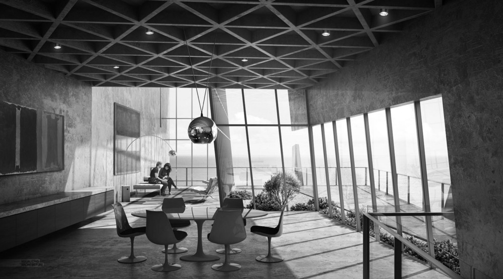
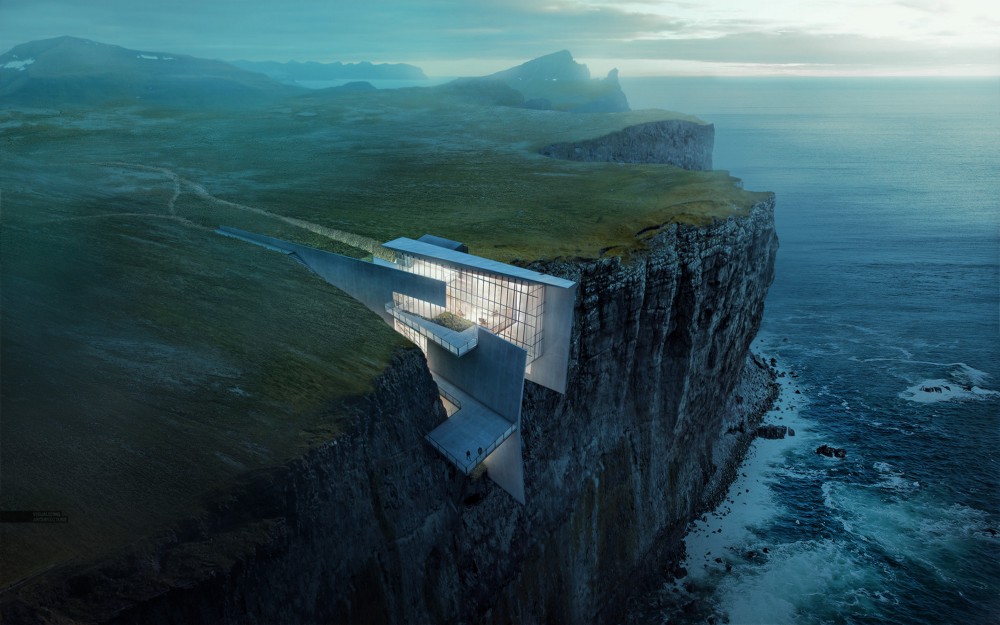
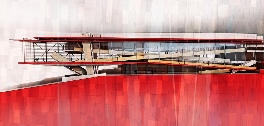
It’s difficult to choose a single project that represents my approach because I try to push each project in a slightly different direction style wise. However, a recent project that garnered a lot of attention was my cliff retreat design, and specifically the aerial perspective rendering of that project. That image was largely created in Photoshop, and is a good example of what a photoshop heavy workflow can produce. It consisted of many images stitched together with extreme lighting and textural manipulation. In some ways, that image combined many of the tutorials that I discuss on my website into a single narrative. Other illustrations of that project such as the sections took on a much more textured and rough quality that recalled some of the ruggedness of the landscape, while other images had a more contemplative feel referencing the undeveloped and ruralness of the site in such a dramatic and inspiring setting. While each illustration was different in style from the other, they all attempted to reinforced the story of the project.
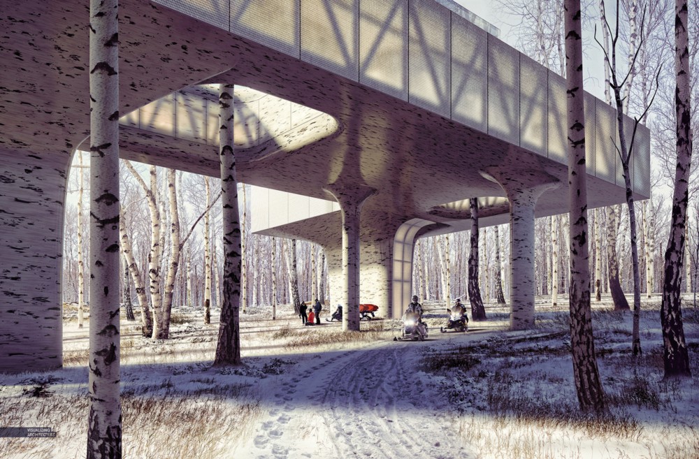
Currently, I am also developing series of illustrations for a design that I created of a research lab in Alaska. The setting is within a birch tree forest which sets up a unique and poetic environment. One of the things that I have been discussing on my website is the use of visualization as a design tool and not just something that happens at the end of the project. In this project in particular, I am using visualization to make decisions early on about form and materiality. Because of technology and modern workflows in visualization, files can be setup to allow for quick editing and updates. Thereforehigh quality visualization can be used in parallel with the development of the design/3d model to help make decisions during the design process. Because these images are being used to study the design, they naturally have taken on an experiential angle, as opposed to something less natural such as a bird’s eye view or an aerial. Instead, the cameras are placed at important moments of the experience such as when one first approaches the structure from a distance through thick trees, or as one walks underneath the structure getting ready to enter it. A completely different type of illustration was created to study different sectional ideas that was more diagrammatic in nature. All of these illustrations are serving an important role in the design process as opposed to quickly being generated at the end to better present the project.
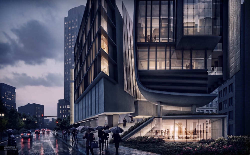
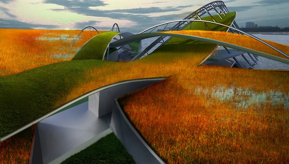
Projects such as the Boston Cultural Center and the Boston Wharf where also important in the sense that those projects took some of the early fundamental techniques discussed on my website and applied them to higher quality visualization. For example, a technique on shifting a daytime image to a nighttime image using only Photoshop was revisited in an illustration of the Boston Cultural Center. The newer illustration was much more advanced in its setup compared to the original tutorial, but the same principal of darkening the image and then erasing to reveal the lighter image below was unchanged. A technique of adding grass was revisited in an illustration of the Boston Wharf, but again at a much higher level of quality and sensitivity than in the original tutorial. Many years of working on hundreds of illustrations have built up a higher sensitivity to image making, but the fundamentals largely remained unchanged. I think this is important for people to understand, but also see in action through my website.
On his design toolkit
Like I said, I use a very Photoshop heavy workflow on my website. In terms of 3D software, I primarily use Sketchup and V-Ray. The combination gives me the right amount of speed and flexibility. Once I have a decent base file to work with, I will usually spend 50%-75% of my time in Photoshop adding textures, people, vegetation, and atmosphere.
On the future of the architecture industry in the next 5–10 years
All signs point to Virtual Reality. With that said, Virtual Reality won’t replace traditional visualization methods, it will just be an additional tool in the representation toolbox. Clients will still need 2d images and video, but VR will slowly incorporate itself into the presentation deliverables as clients become more comfortable with the technology and presentation of VR becomes more accessible. Also, software is becoming more and more intuitive and advanced which means an understanding of the technical side is becoming less important. However, it still difficult to get software to make proper artistic decisions, and that is where the visualization artist will still be depended on to generate compelling images.
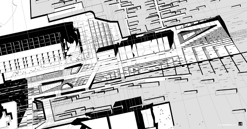
Boston Wharf Black & White Site (Image courtesy of Visualizing Architecture)
On advice he would give himself
That’s a good question. I probably would tell myself to study composition and light more. Similar to photography, composition and light make or break an image. I spent much of my time trying to master Photoshop techniques and render settings that I didn’t put enough emphasis on some of the more fundamental parts of image making. I think studying light and composition would have pushed my earlier images to a much better place. It’s a mistake that many people starting out in school and this profession make.
Thoughts on going back to architecture
I miss some parts of architecture a lot, but there are many parts of architecture that I don’t miss (laughs). Conversely, I can’t think of any part of architecture visualization that I don’t enjoy. Every week, I get to work on completely new images for some of the most exciting projects being built around the world. I get to be an artist everyday, and through my website, I get to talk to and meet people all around the country and world. It really is exciting.